Company
Boeing
Product
Boeing Learning Solutions (BLS 2.0)
Timeline
2017–2024
Domain
Aviation (Ab-Initio Training)
Problem
A profitable LMS with 5,000+ users whose navigation and architecture had grown beyond what its UX could carry
Approach
Build the measurement layer first, then redesign around real personas, real flows, real friction
My role
UX lead across research, IA, flows, UI system, and roadmap planning by PI
Solution
Reframed BLS as a multi-role platform. First data-grounded persona dashboard.
01 Context
An LMS that grew faster than its design could keep up
Boeing Learning Solutions is the platform flight academies use to deliver EASA ATPL, CPL, PPL and related pilot training programmes. Over the years it has served more than 5,000 users including cadets, instructors, heads of training, and academy staff, across nine countries and dozens of academies, spanning a product family from EASA ATPL through MCC, JetSys 525, and FAA ATP.
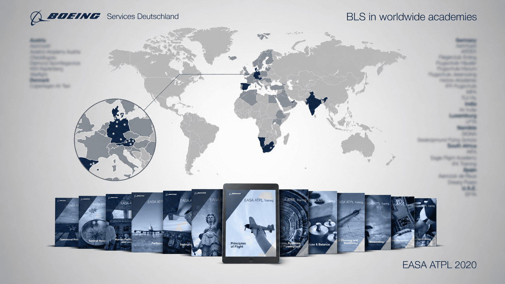
BLS in worldwide academies. Nine countries, dozens of academies, a product family across EASA ATPL, CPL, PPL, MCC, JetSys 525, and FAA ATP.
I came into BLS as UX Lead after years inside the content side of the same training ecosystem at Boeing, first as multimedia lead on the EASA ATPL course series and then in UX leadership across the platform. The content academies handed to their students lived inside BLS, including the CBTA material covered in Case Study 03, so I knew it from the inside out. That familiarity made the early conversations with customers more efficient. Coming in already fluent in the vocabulary and constraints let the first sessions focus on what was actually broken, instead of using them to get up to speed.
The product had grown so feature-rich over time that a thorough analysis was needed to understand where its navigation and architecture had drifted away from its core. The redesign, BLS 2.0, was the response. To scope it well, I facilitated several workshops with engineering and leadership before major redesign work began.
Official resources
02 The Problem
A platform that worked technically and needed sharper focus
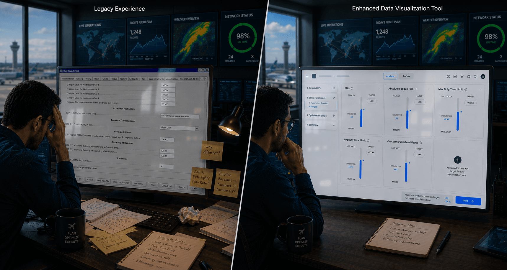
The product worked. What had grown harder over time was using it well: knowing where to click, how to navigate between modules, and whether what appeared on screen was meant for you. Years of feature additions had layered modules without structural review, and the design team was operating without analytics or grounded personas.
Legacy BLS
Feature-rich, role-flat, evidence-light
One interface served five very different roles with no distinction between them
Navigation had grown by accretion, the same page reachable from several differently-labelled paths
Most design decisions had been made with administrators in mind
No analytics and no grounded personas, so priorities rested on assumption
BLS 2.0
Role-aware, measured, structurally honest
IA, permissions, and navigation visibly tell each user what they are there to do
Built on measured behavior, not assumption: analytics and data-grounded personas
Students recognised as the primary user base and designed for accordingly
Cleaner structure, redundant paths removed
03 Research
Building the measurement layer the team had been missing
The first redesign decision wasn't a design decision. It was instrumentation. Adobe Analytics went in across the core flows. In parallel, I led the Power BI initiative for the product, wiring it into the user database to produce the first data-grounded persona dashboard BLS had ever had. That surfaced something the team had assumed but never measured: the user base was predominantly students, while most historical UX decisions had been made with admins in mind.
Customer interviews and usability tests ran in parallel with European academies. Showing up with specific questions instead of a slide deck moved the conversations quickly.
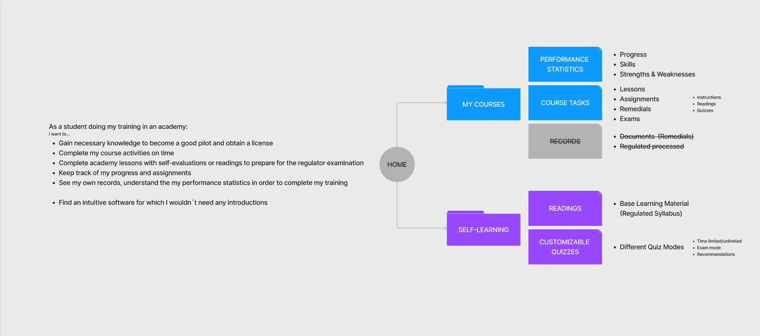
Journey map from the ideation phase, in the students' own voice. "Find an intuitive software for which I wouldn't need any introductions." That line set the bar.
04 Design
Reframing BLS as a role-aware platform, not one product for everyone
The instinct was "fix the UI." The research said the UI was a symptom. BLS was trying to be one product for five very different roles (Administrator, Head of Training, Instructor, Course Student, Self-Learner) without ever making that explicit. The reframe was to design BLS 2.0 as a role-aware platform, where IA, permissions, and navigation visibly tell each user what they're there to do.
I facilitated several Design Thinking sessions to build internal alignment, reduce knowledge silos, and improve collaboration across the team. The sessions created space for colleagues to share knowledge, increase awareness, and co-create solutions to long-standing operational challenges.
05 Delivery
UX planned to the same rhythm as engineering
The team operated on a SAFe-style cadence with Program Increments. I built a UX roadmap aligned to that rhythm (PI-24-1 through PI-24-5) to support and direct the design team, plan upcoming work, and give engineering and leadership clear visibility into what UX was delivering alongside each release. The roadmap doubled as a stakeholder tool: explicit dependencies, feedback loops, and a shared view of where design was investing its time.
I led a team of three UX designers based in India, with daily handover and weekly design reviews. Each module ran through two design loops: low-fidelity prototypes reviewed with students and admins, then high-fidelity Figma prototypes on a shared design system. Two workshops anchored the harder pieces, the Notification Service Email Redesign and MFA alignment.
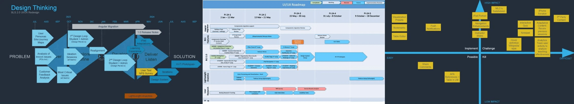
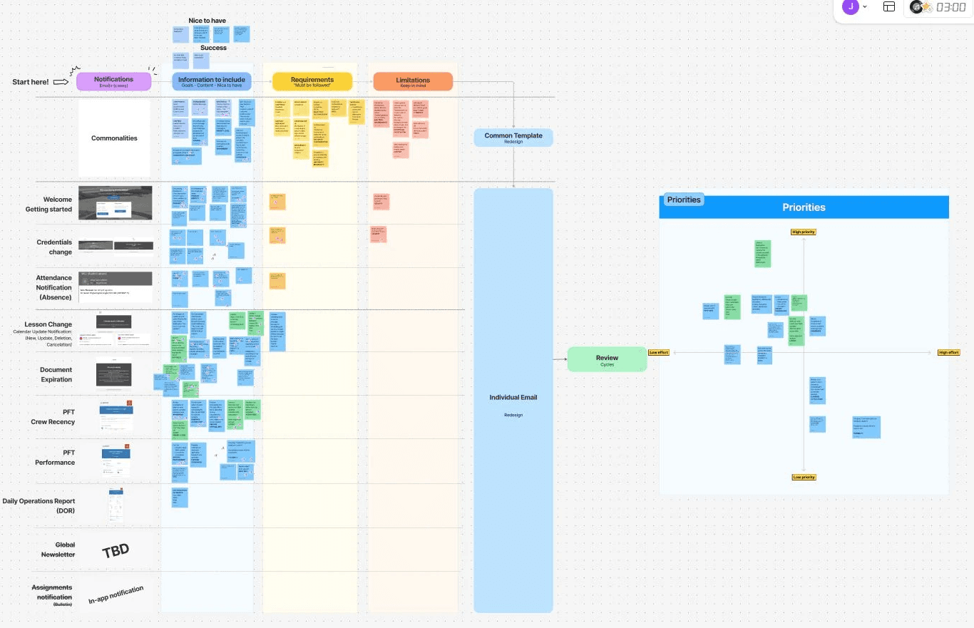
UX roadmap suite: high-level prioritization map to align product direction with leadership, and technical roadmap by Program Increment with design focus areas, engineering dependencies, and feedback loops feeding the next increment.
06 Outcome
Work that shipped, lessons that carried forward
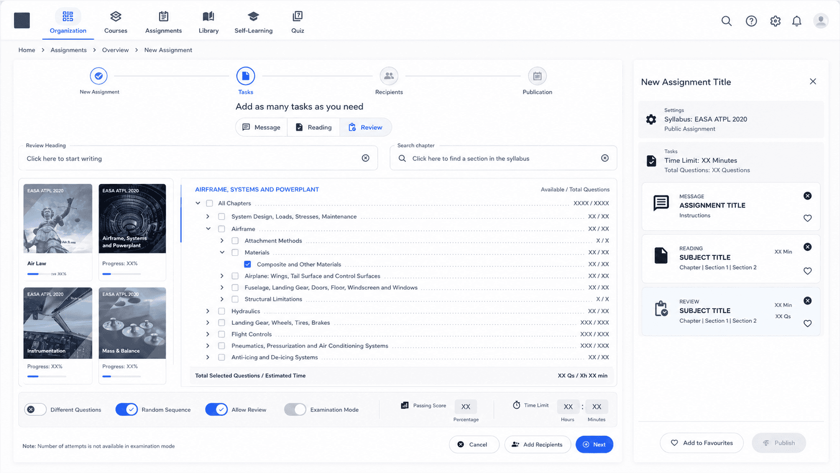
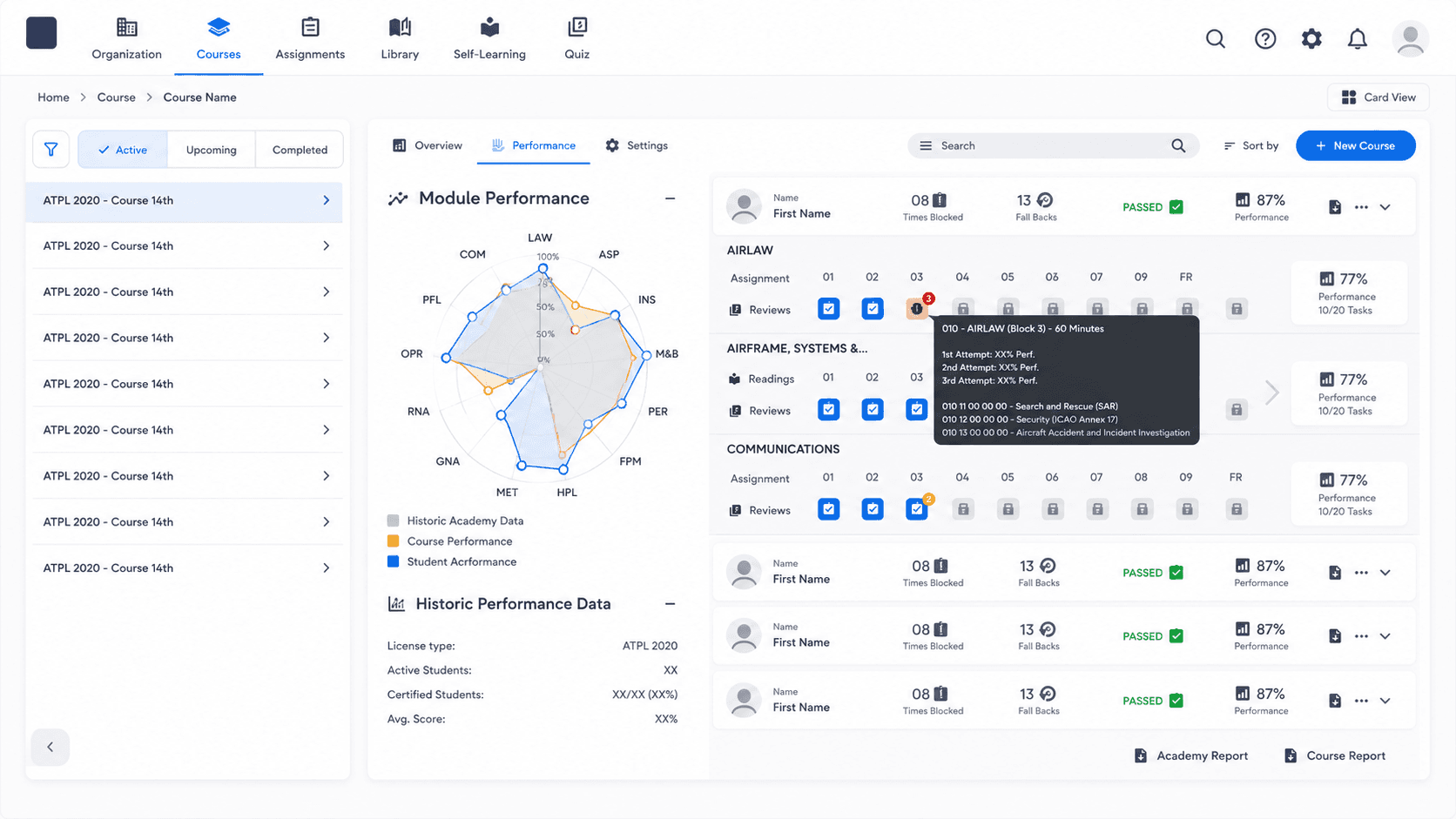
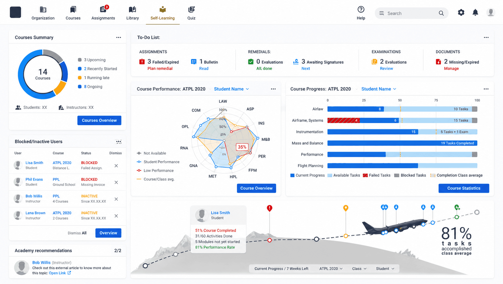
BLS 2.0 shipped progressively across the 2024 Program Increments. By the time Boeing's broader Early Career strategy pivoted toward a next-generation platform, the redesigned modules (admin home, User Creation, the assignment flow, the syllabus pages, notifications) were in production or late development. In usability tests, academies rated the new flows as faster, clearer, and finally built for them.
My other work taught me to treat a launch as a hypothesis to be measured. This taught me something that sits alongside it: even a well-designed measurement programme only delivers value when the timing is right and the organisation is ready to act on what it finds.
We invested significant effort designing an NPS programme: role-targeted, segmented by license, ready to run. Timing decided otherwise: strategic priorities shifted, and the survey wasn't released under BLS. Designing the instrument is not enough. The timing has to be there too. The work itself carried forward.
5,000+
users across cadets, instructors, heads of training, and academy staff
9
countries running BLS as their primary training platform
5
distinct user roles, each with different goals and entry points
01

02
03
04
What it took
The first move wasn't design, it was instrumentation. Standing up analytics and the first data-grounded personas BLS ever had, then using them to challenge an assumption the team had carried for years, that the product was for admins, when the data said it was mostly students.
The harder half wasn't the dashboards. It was shifting how the team made decisions, making evidence part of the conversation instead of an afterthought. With 4 designers across a distributed setup, the real work was keeping research, design and delivery moving to the same rhythm.
07 Reflection
On measurement as a culture change, not a deliverable
The lesson I carry from BLS: when a product feels heavy, the answer is rarely just the UI. The deeper question is who the product is for, and how clearly it shows that to the people using it. Making roles visible in the interface did more for the experience than any specific visual change.